

Every European (and I guess non-Europeans as well) can vote what our next Euro design will be: https://surveys.ecb.europa.eu/10b/neweuro/
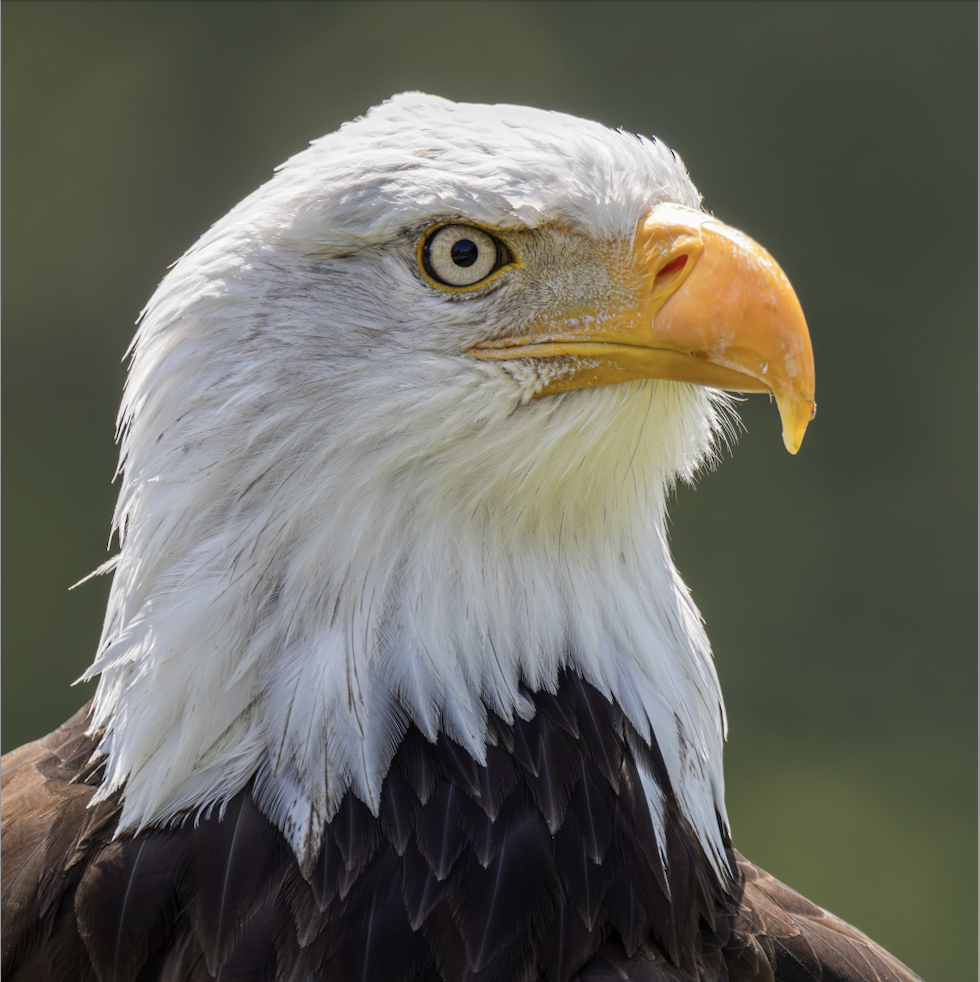
About ten different designs are available and about half of them feature birds instead of boring people.
I really like the bird designs as they symbolise freedom without borders. Hope one of them gets chosen in the end.
I much prefer the birds over the people =w=
I mean, most of the people on there have 0 relevancy to my country, and I imagine it’s not an uncommon sentiment elsewhere. Birds at least don’t exclude a bunch of countries
I also quite like the vertical/portrait orientation designs in there, I think it would be a cool change
I tell you 100% of those people have 0 relevancy to my and many other EU countries
Honestly, I have not seen or heard anyone say, they would like the people on the notes. Those have to exist somewhere, since the people are even a suggestion - but if the design chosen is people, I will 100% believe someone high up specifically decided on it, over what was actually favored.
Same. I hate people
Funny, I was about to say I’ve never seen a single one of the spieces depicted in the image. 😂
Well the 50 is a white stork, actually the national bird of my country :3 we have (or used to have back when I learned it in school) the highest nesting density of storks :3 and also a holiday about celebrating storks
The others I believe are:
I’ve seen a few of those in the wild, but definitely not all :3
FYI, Design B has the names of the birds printed on the notes, and you’re correct about all of them.
https://www.ecb.europa.eu/euro/banknotes/future_banknotes/html/design-proposals.en.html
Portugal? All the storks and enormous nests balanced on everything is hilarious, I love it.
Lithuania :3
We have the same thing with stork nests on everything tho
That’s cool. Very much on my list of places to visit. Was in Portugal last week which is why that came to mind first.
It’s always interesting to me when people choose to visit here :3 I suppose cause all of it is quite standard to me lol
If you do come, I hope you visit more than just vilnius tho. A lot of people seem to just stick to it, and not see any of the rest of the country ^^
That would be my bird criticism too. I recognized 4/6 people on the notes but have no idea what these birds are or where they live. I would expect crows, magpies, swallows, seagulls or even those green parakeets that are technically invasive but are all over Europe.
It’s crazy and unacceptable we didn’t get a corvid.
I assume these are in the same order for everyone, but I loved the first set of vertical ones; the ones with might contrast. Most of the designs felt afraid to use color, since the note is supposed to be one color to identify them easily. I honestly think having the high contrast with the birds makes them easier to identify though. 90% of it was still the right color, so that’s still easy to see. Having the image stand out just gives it another identifiable piece though, which can’t hurt, and it makes them look so much prettier.
I believe they’re under the same letters for everyone. I’ll include the pictures just in case :3
For me “D”
Is my favourite overall, I love the bright colours on it, though I think the 20 maybe is a bit crowded, with the multiple birds and the security strip it all kinda clashes and you lose the shapes in the middle imo
The other vertical ones with birds (“I” and “J”) are my 2 runner ups, (I just think the vertical designs are cool :3), “J”
I think has better colours than “I”, and I like that the colouration of the birds is somewhat preserved in the accents on them both. “I”
Overall looks the most rustic/traditional, while “D” the most modern I think.
Yeah, they’re all good! For me, I is my favorite. J is a close second. I like that the birds all inhabit approximately the same location on J though, all entering that circle. It’s a nice touch. D I feel is too plain, but it may be slightly better functionally. It definitely looks more like currency. I is the most artistic and interesting I think.
I definitely like the birds more than the fictional bridges
Saying people like Marie Curie have no relevancy to your country just because they are not from your country is a wild statement. Maybe also the reason for why the idea of “Europeans” as a people is not working out yet.
Now do US South and North.
Veetical designs ftw. I want vertical bills so mich:3