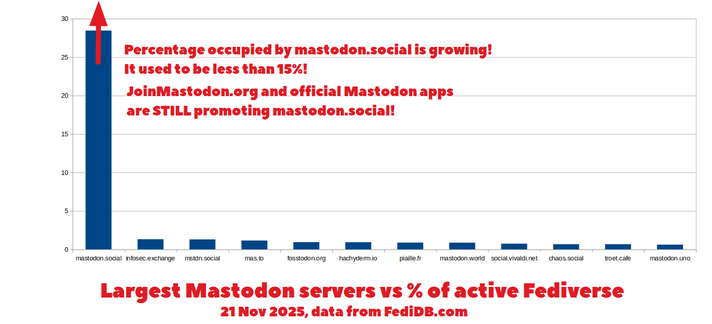
The graph doesn’t actually say what the y-axis is showing. Percentage of what? User accounts? Active user accounts? Posts? Interactions?
If mastodon.social is the default instance for new users, it could just have a load of inactive accounts of people who tried it and didn’t stick. Or it could have the same number of accounts as others, but the accounts are just way more engaged in posting.
It’s impossible to tell from this graph.