SDF Chatter
  • Communities
  • Create Post
  • Create Community
  • heart
    Support Lemmy
  • search
    Search
  • Login
  • Sign Up
𞋴𝛂𝛋𝛆@lemmy.world to Typography & fonts@lemmy.caEnglish · 6 months ago

1892 hit hard

lemmy.world

message-square
10
fedilink
75

1892 hit hard

lemmy.world

𞋴𝛂𝛋𝛆@lemmy.world to Typography & fonts@lemmy.caEnglish · 6 months ago
message-square
10
fedilink

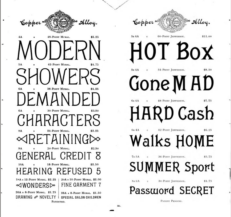
Joke aside, there are several cool fonts in this one from 1892:

https://archive.org/details/CentralBoston1892Specimen/page/n73/mode/2up

alert-triangle
You must log in or register to comment.
  • Obi@sopuli.xyz
    link
    fedilink
    English
    arrow-up
    7
    ·
    6 months ago

    These are fresh as hell, doesn’t really feel dated at all.

  • Omega@discuss.online
    link
    fedilink
    English
    arrow-up
    6
    ·
    6 months ago

    These are fucking amazing

  • Brave Little Hitachi Wand@lemmy.world
    link
    fedilink
    English
    arrow-up
    4
    ·
    6 months ago

    Such impetuous typography! Saved

    • 𞋴𝛂𝛋𝛆@lemmy.worldOP
      link
      fedilink
      English
      arrow-up
      3
      ·
      6 months ago

      I like the emotions these convey. Each one clearly has a theme and tone when I see them in passing.

      • Brave Little Hitachi Wand@lemmy.world
        link
        fedilink
        English
        arrow-up
        3
        ·
        6 months ago

        The semiotics are vivid

        • 𞋴𝛂𝛋𝛆@lemmy.worldOP
          link
          fedilink
          English
          arrow-up
          2
          ·
          6 months ago

          You leave me couched but obsequious despite my apparent cloysome temerity in lexis and style

  • distantsounds@lemmy.world
    link
    fedilink
    English
    arrow-up
    4
    ·
    edit-2
    6 months ago

    Sharp feet everywhere! Ty for sharing. Most of these were new to me and a fun style to dig into. Cheers!

  • Dalvoron@lemm.ee
    link
    fedilink
    English
    arrow-up
    4
    ·
    6 months ago

    “we didn’t start the fire…”

  • reddig33@lemmy.world
    link
    fedilink
    English
    arrow-up
    3
    ·
    6 months ago

    Gothic Italic is very “one of these things doesn’t belong here.” It looks more 1940s.

  • TurtlePower@lemm.ee
    link
    fedilink
    English
    arrow-up
    2
    ·
    6 months ago

    Is this rap lyrics or a typography example cuz some of this would be sick to the right beat…

Typography & fonts@lemmy.ca

typography@lemmy.ca

Subscribe from Remote Instance

Create a post
You are not logged in. However you can subscribe from another Fediverse account, for example Lemmy or Mastodon. To do this, paste the following into the search field of your instance: !typography@lemmy.ca

A community to discuss and share information about typography and fonts

Sibling community:

!typography@lemmy.world

Rules of conduct:

The usual ones on Lemmy and Mastodon. In short: be kind or at least respectful, no offensive language, no harassment, no spam.

(Icon: detail from the title of Bringhurst’s Elements of Typographic Style. Banner: details from pages 6 and 12, ibid.)

Visibility: Public
globe

This community can be federated to other instances and be posted/commented in by their users.

  • 1 user / day
  • 3 users / week
  • 100 users / month
  • 382 users / 6 months
  • 8 local subscribers
  • 532 subscribers
  • 45 Posts
  • 164 Comments
  • Modlog
  • mods:
  • stravanasu@lemmy.ca
  • stravanasu@mander.xyz
  • pglpm
  • BE: 0.19.8
  • Modlog
  • Instances
  • Docs
  • Code
  • join-lemmy.org